Elsie Lee-Robbins
About
Projects
Publications
Filter by: DatavizResearchDVSAwardsShow All
Ecology Center
Dataviz
Ann Arbor for Public Power
LEGO Themes: From Generic to Franchise
DatavizCompetition
Participatory LEGO Data Visualizations
DatavizOutlier Conf Talk
Learning Objectives for Data Visualization
Nightingale ArticleResearchBest Paper 2022
American Institutes for Research - Student Access to Internet
Five Years of Bullet Journaling
DatavizNightingale Article
Memphviz Design
Sustainable Conference Formats
Research
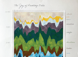
The Joy of Painting Data
DatavizNightingale
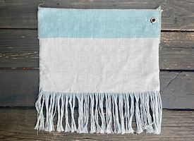
Raveling Data
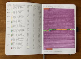
Transportation Emissions
Interested in learning more?
Send me an email! elsielee [at] umich [dot] edu